
Project 01 of 10
The existing Export Essentials sign-up process is confusing, requiring users to navigate three possible entry points and two sections of the myNZTE platform. This complexity led to a high drop-off rate and many unsuccessful sign-ups. Additionally, the course's value proposition, learning formats, and content are not clearly presented during the sign-up process, especially with the addition of sector-specific courses.
I overhauled the information architecture for the sign-up process, transitioning it into a simple linear format within the courses section of the myNZTE platform. After three rounds of user testing and iterated prototypes, the final round of user testing saw participants quickly and easily complete their tasks, giving stakeholders and myself the confidence we we're solving our problem statements.
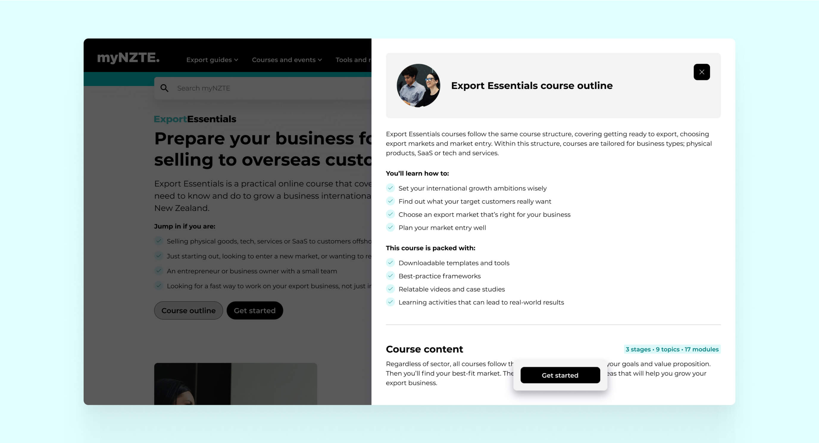
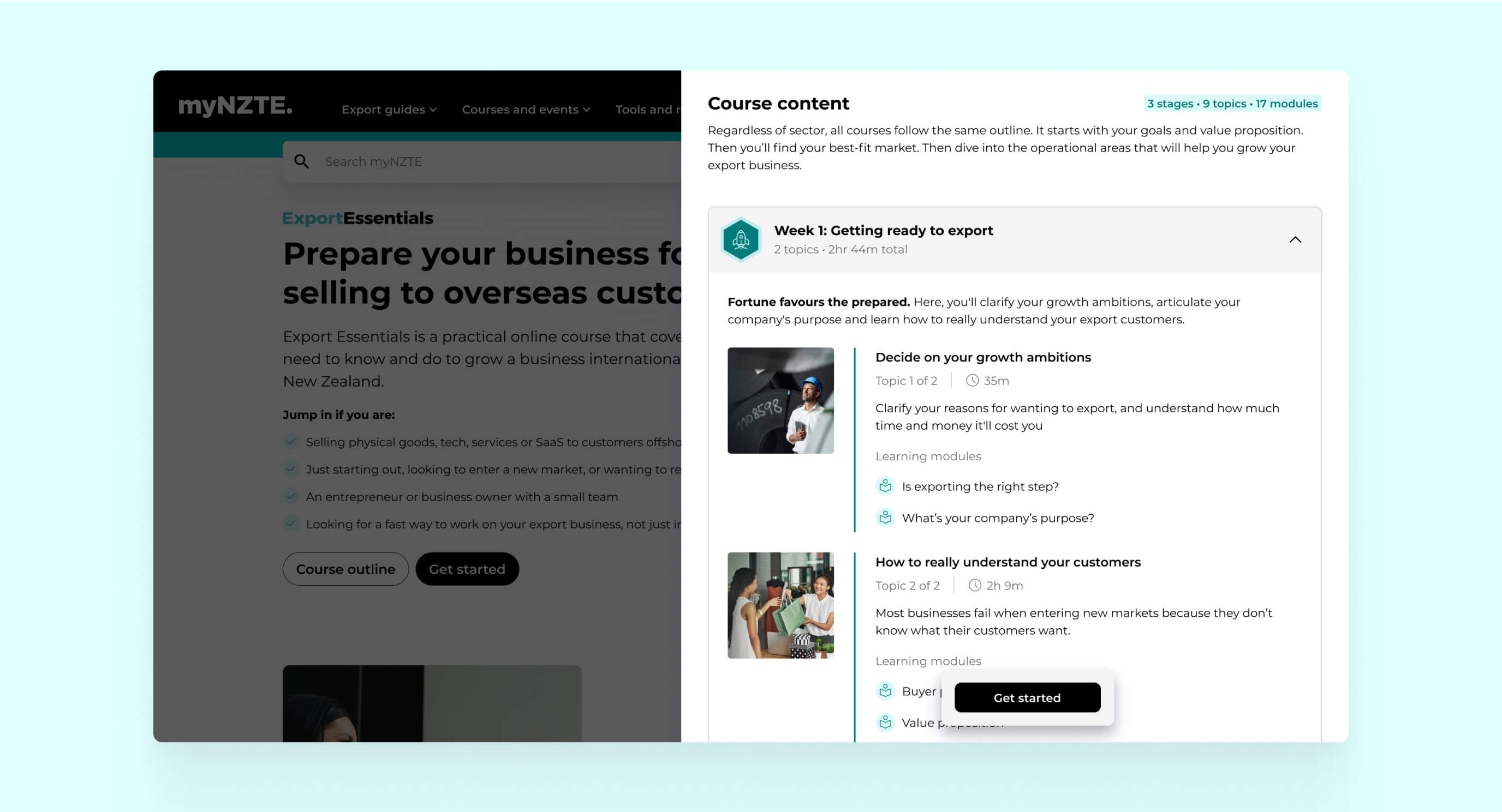
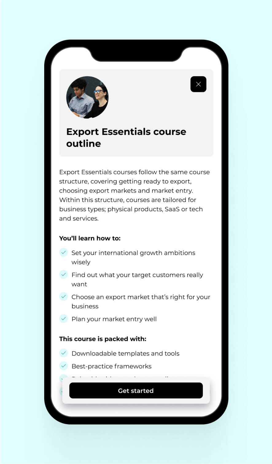
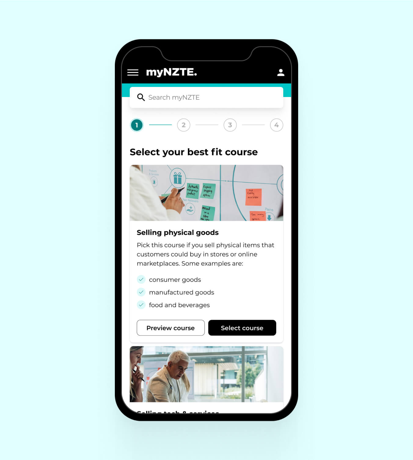
Based on our problem statements and user feedback from initial testing, I designed a landing page that effectively addressed our challenges. It clearly communicated Export Essentials value proposition, course content and learning formats.


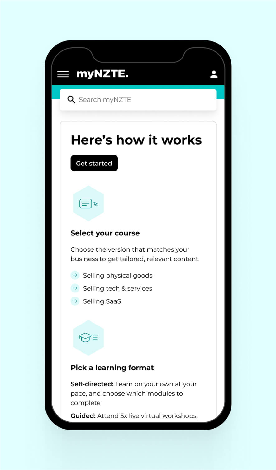
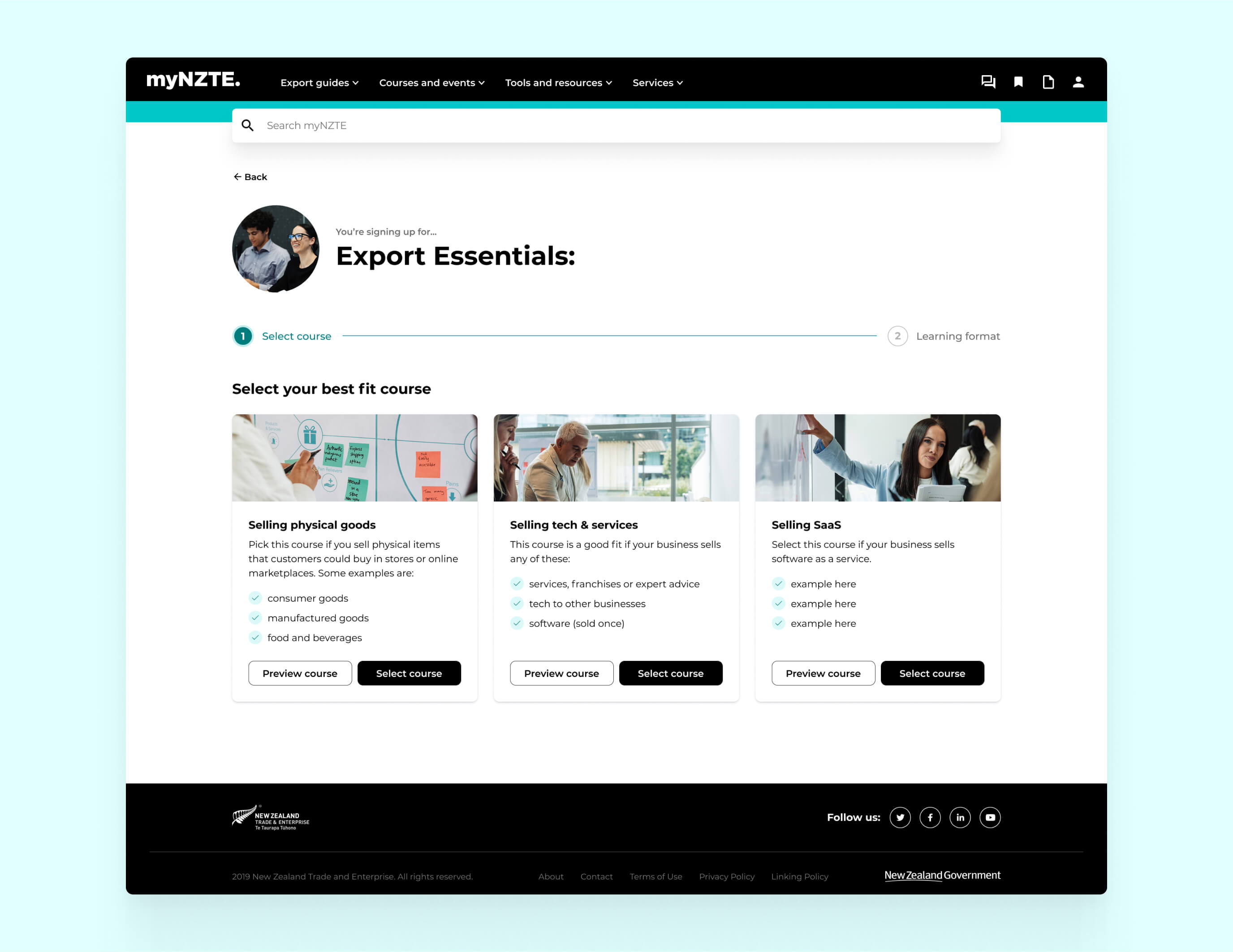
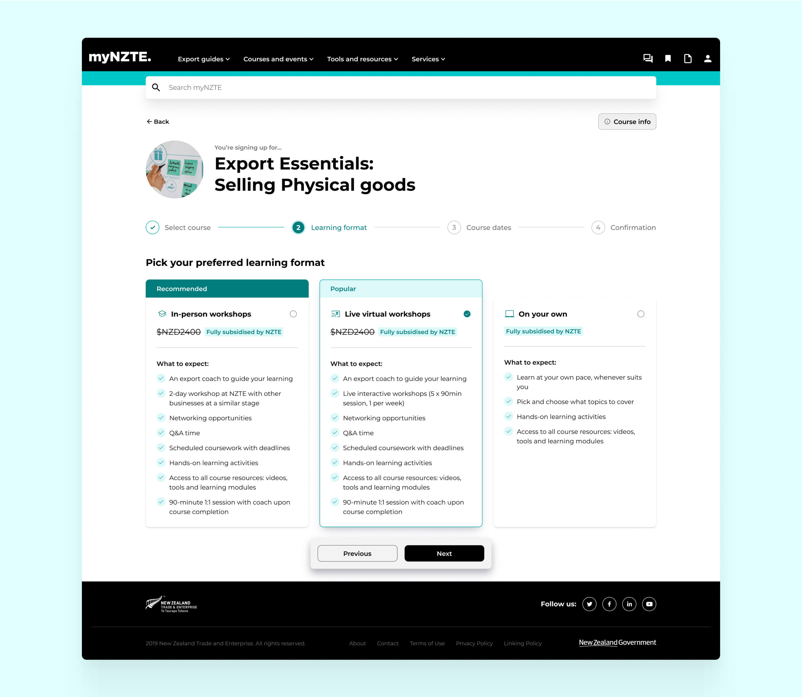
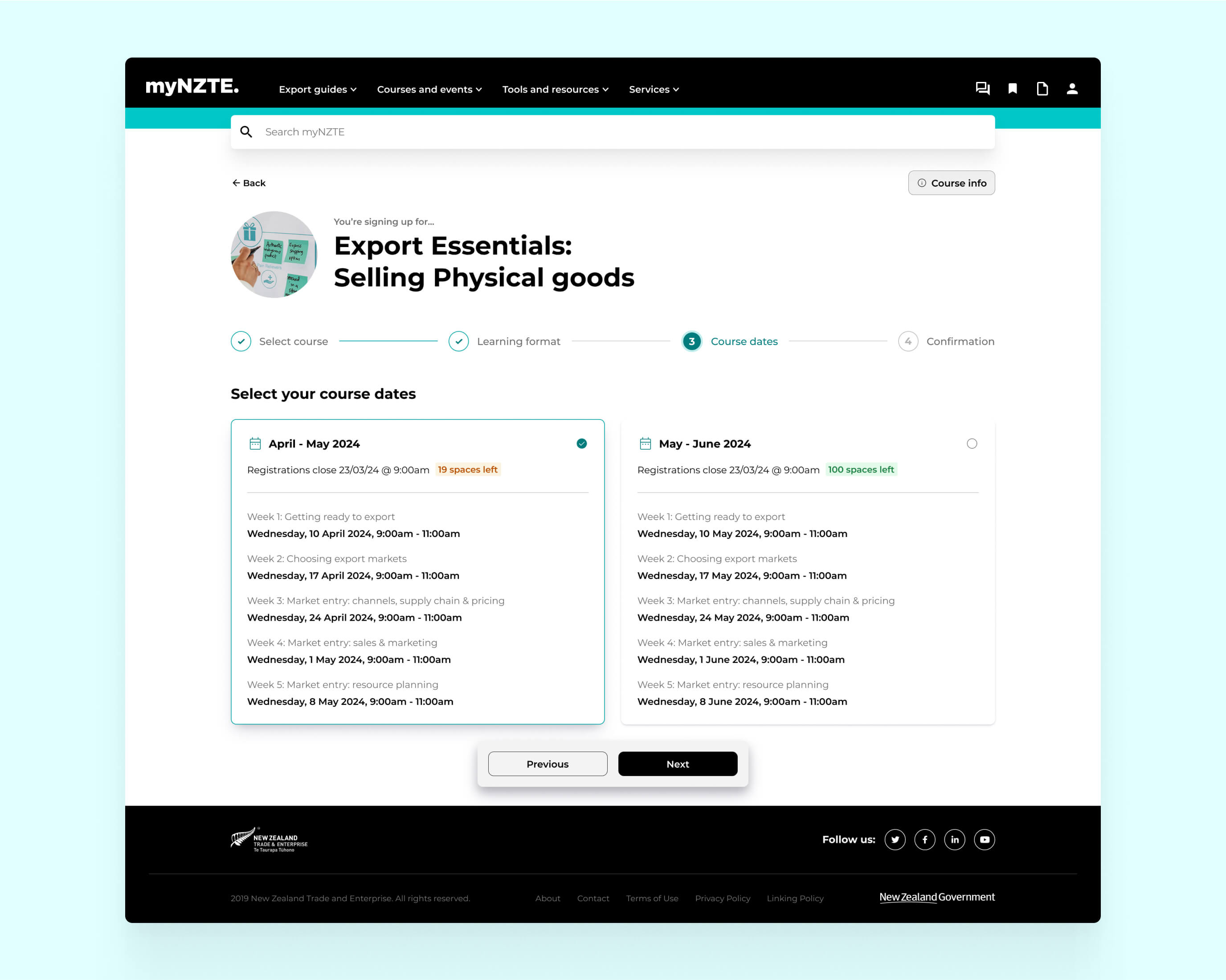
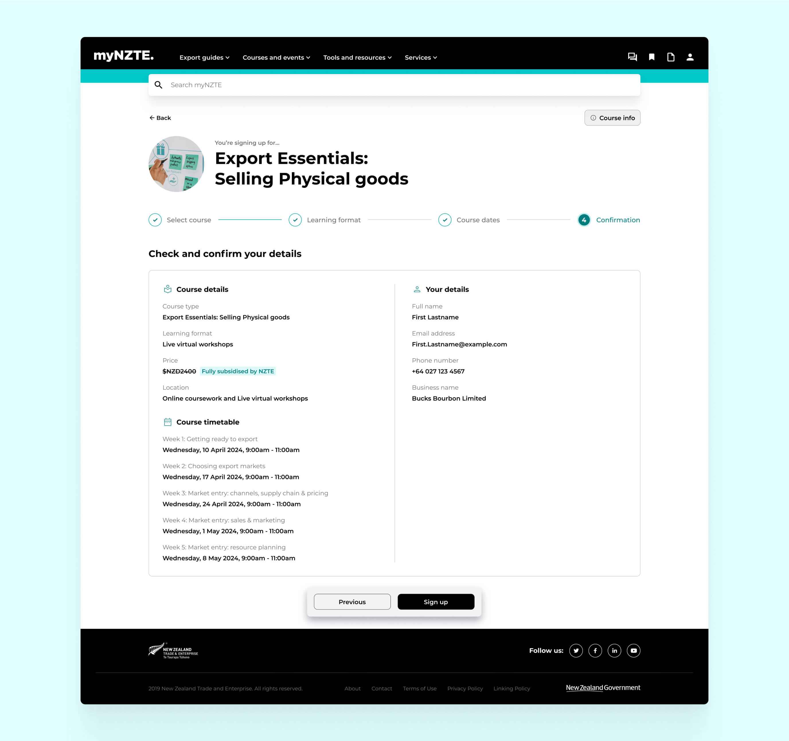
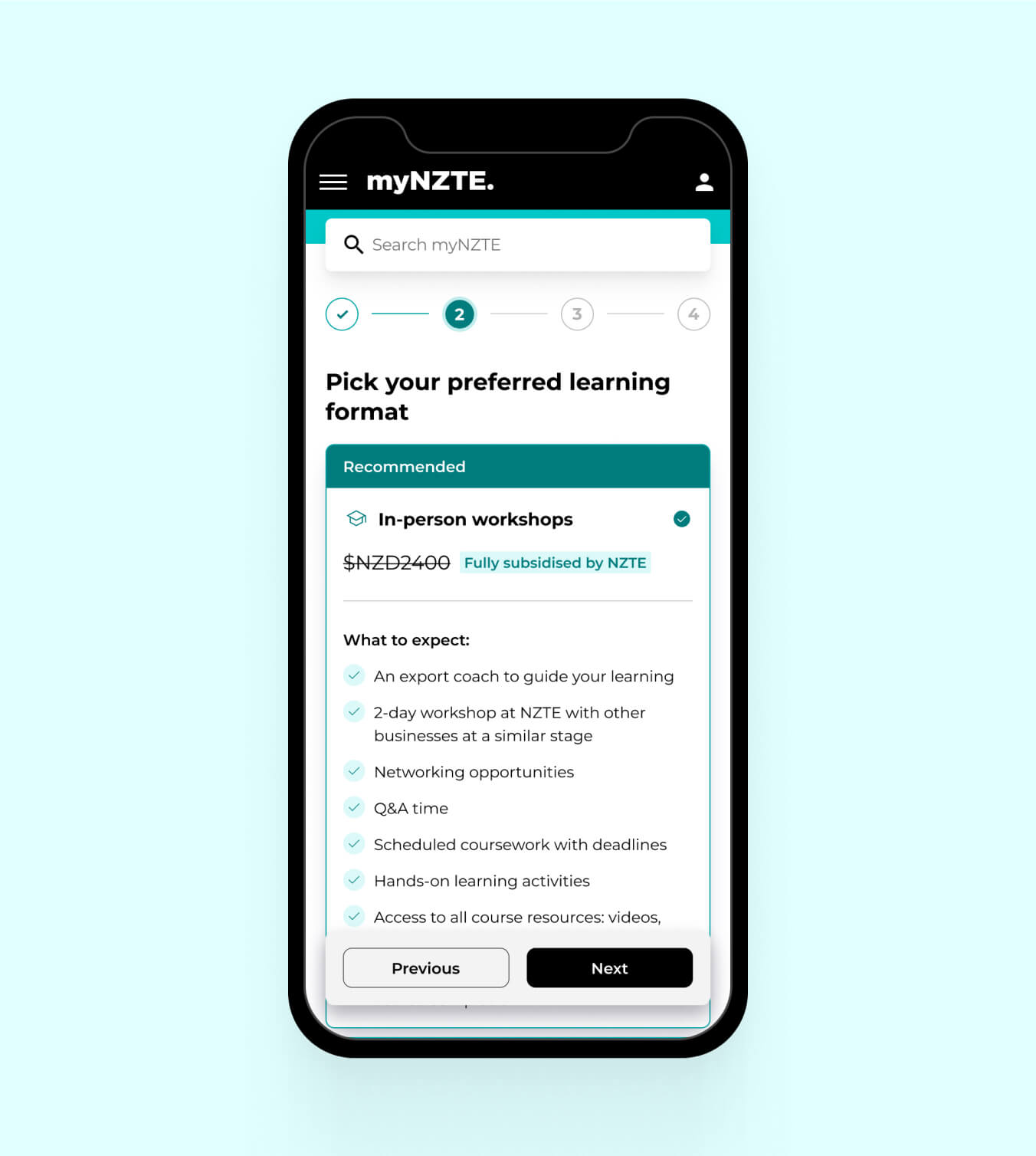
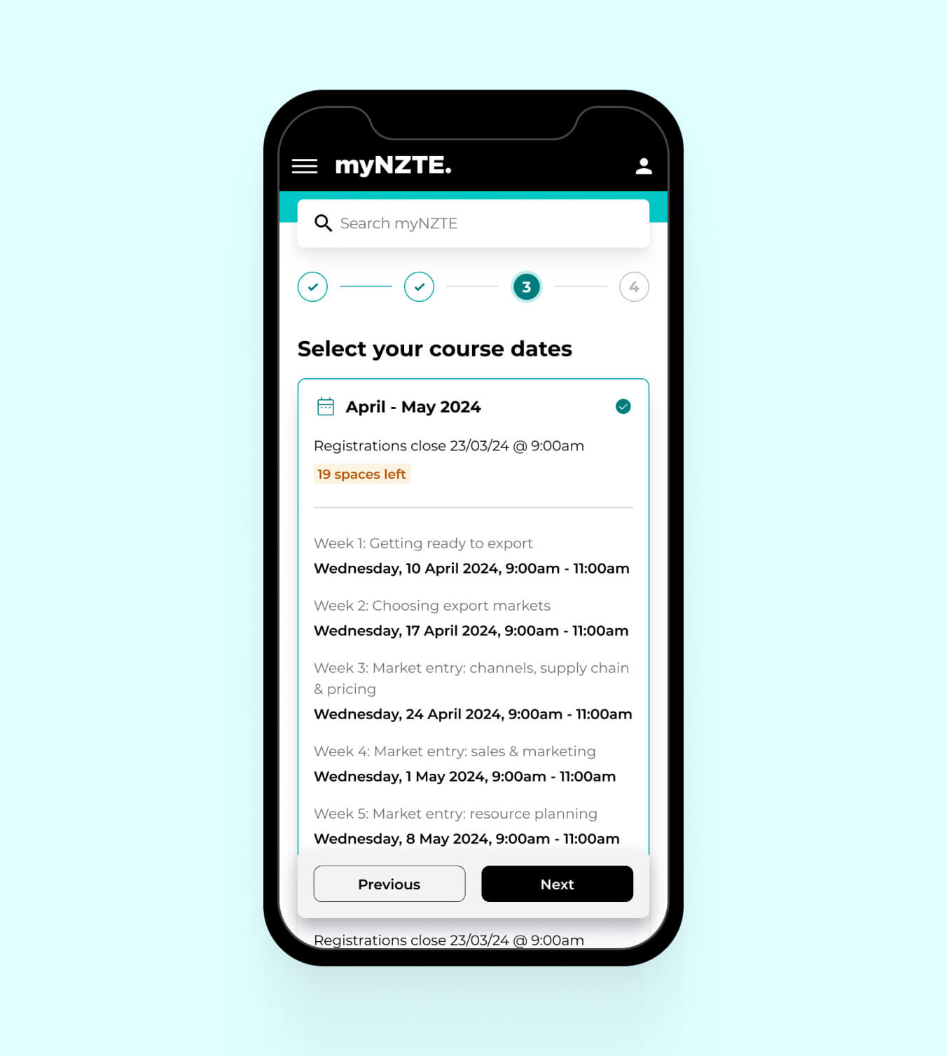
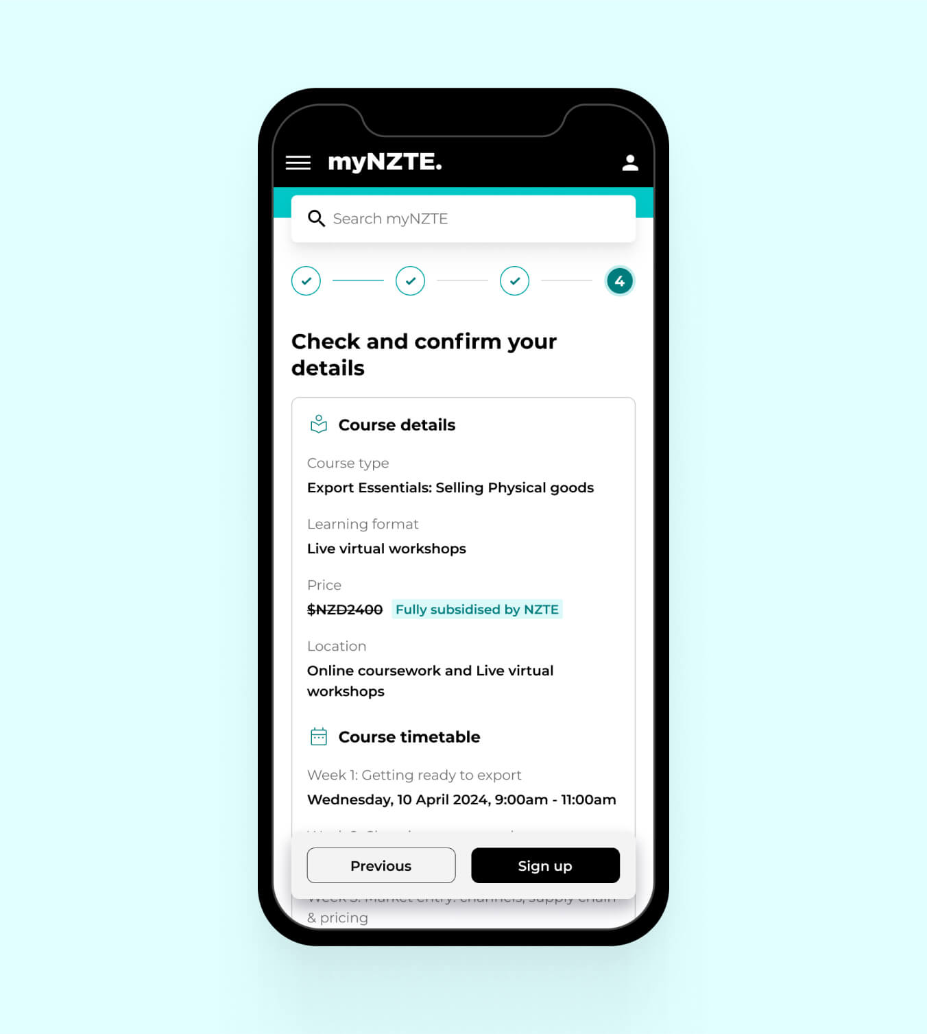
User testing revealed that making all sign-up decisions at once was challenging for users. To solve this, I split the process across multiple screens, with one decision per page. This approach led to a 100% sign-up success rate in user testing.
Anna - Export Essentials usability study, December 2023
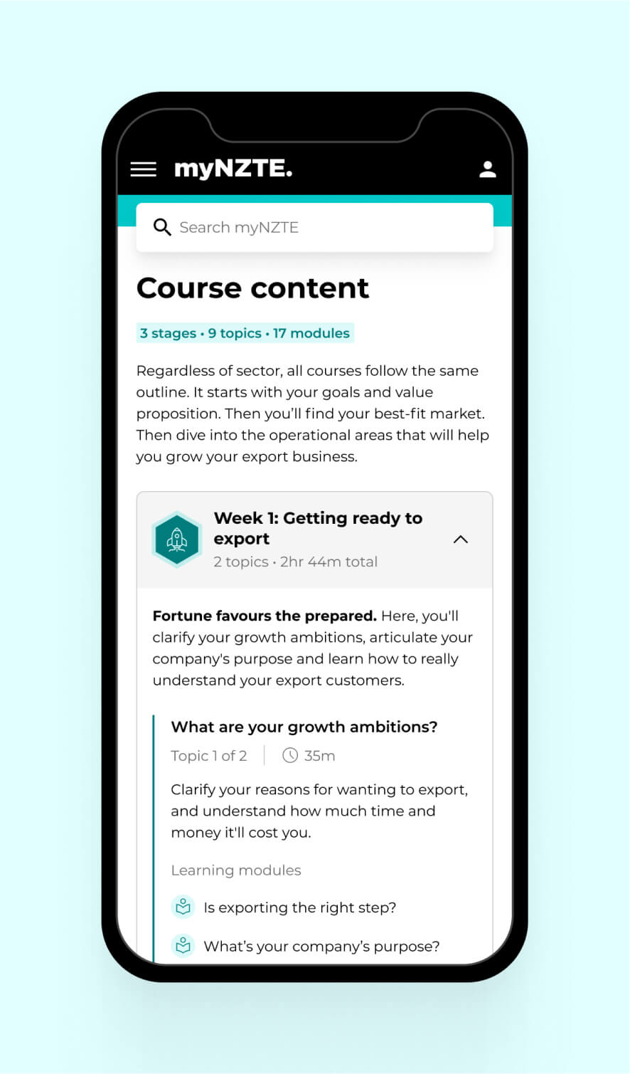
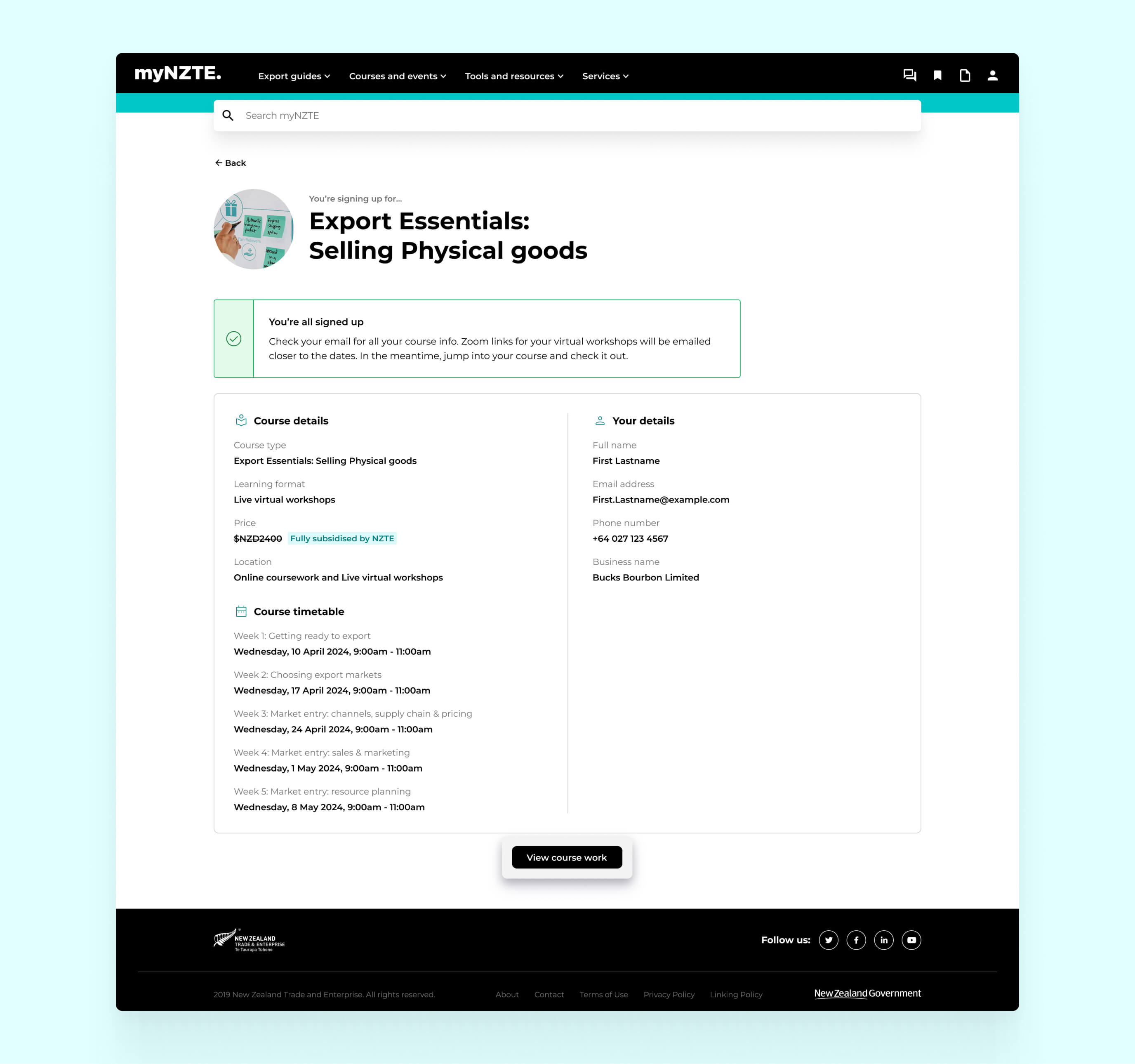
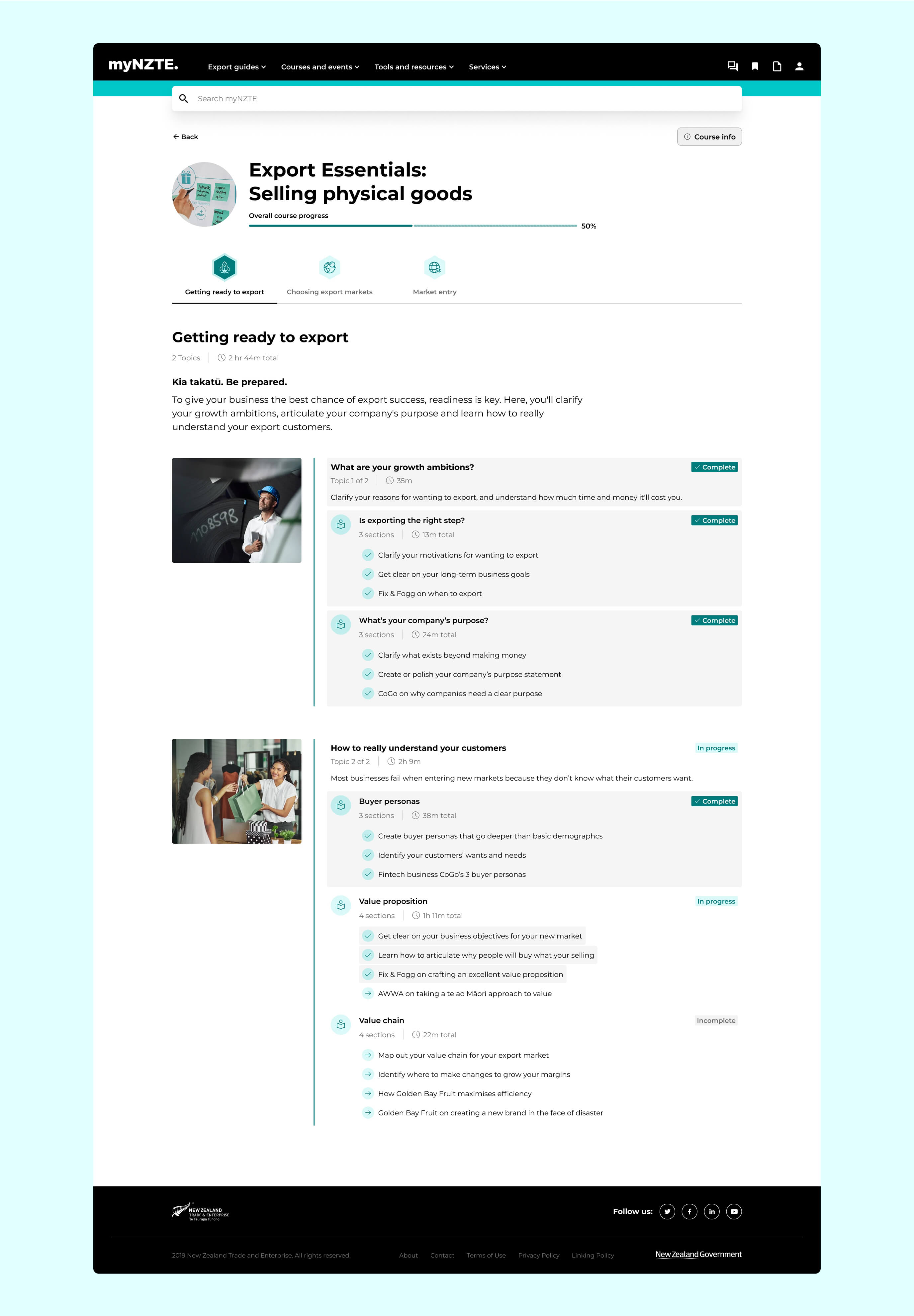
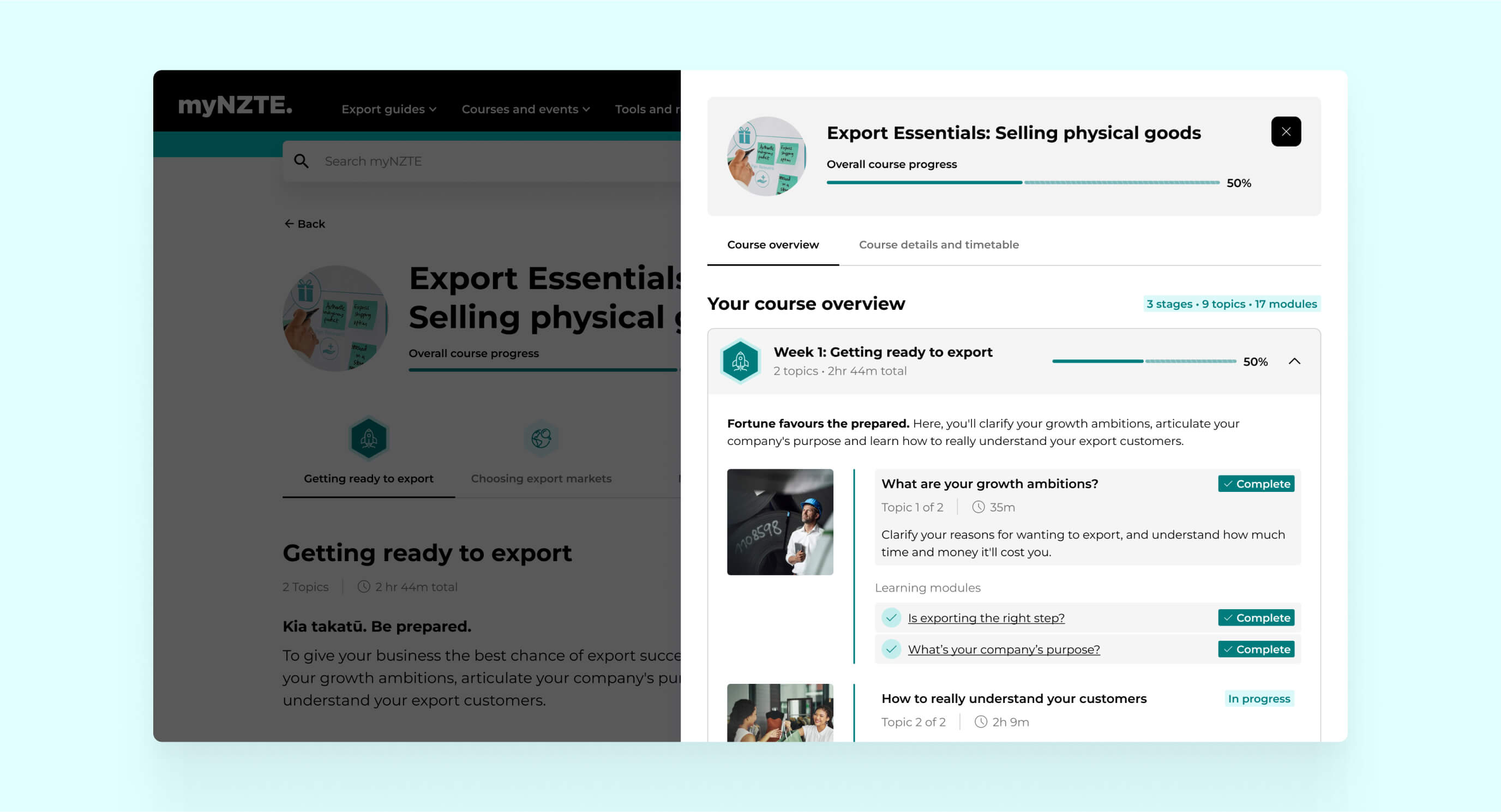
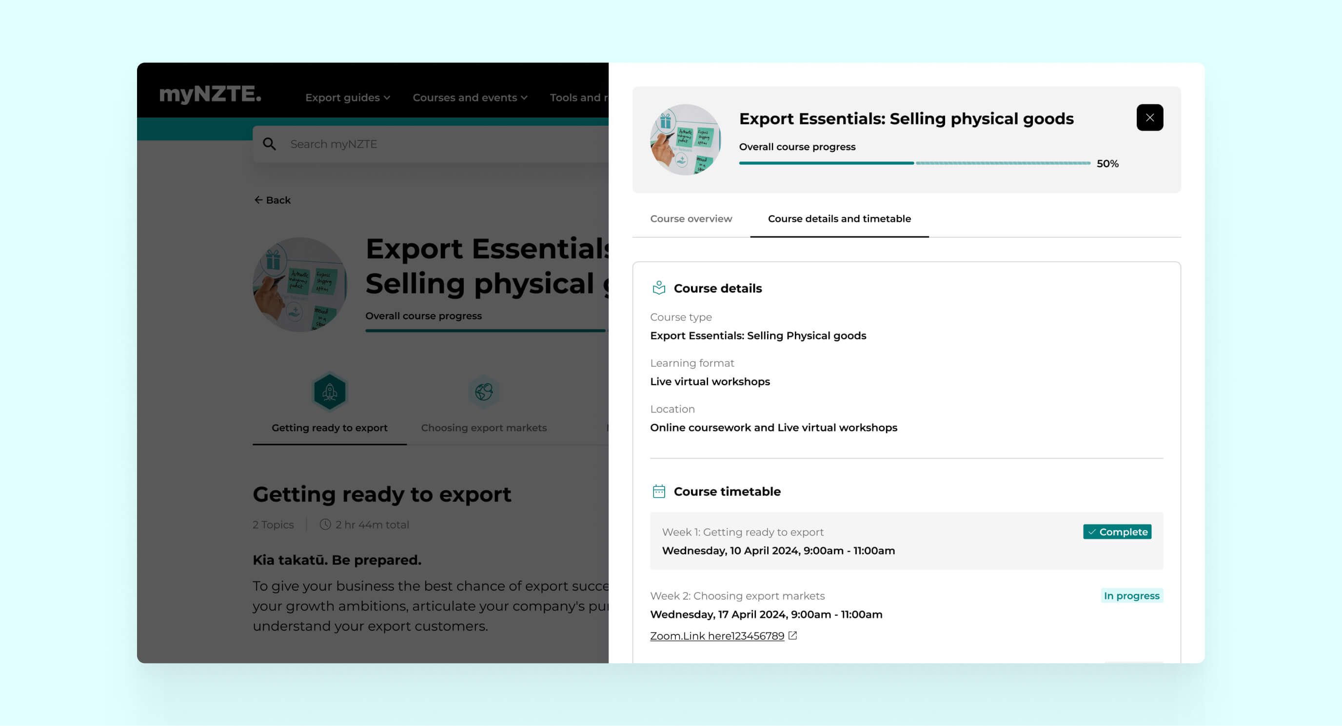
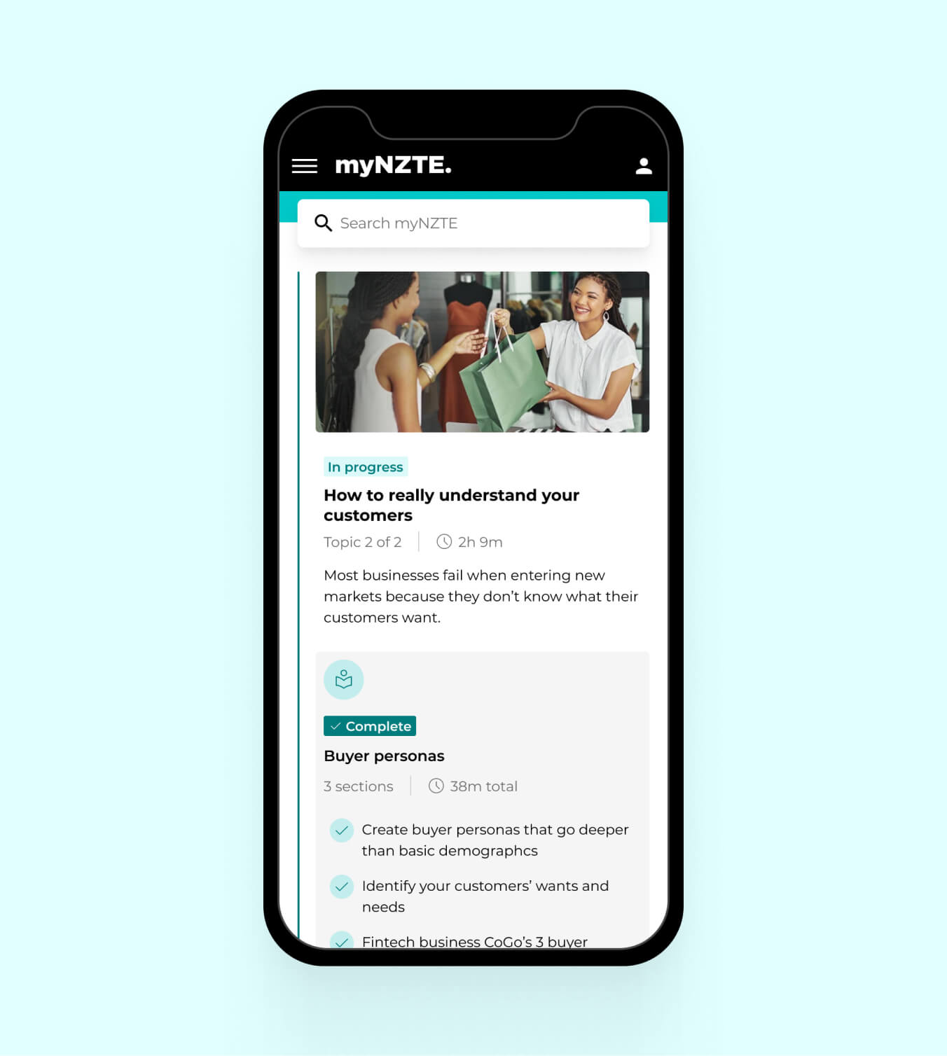
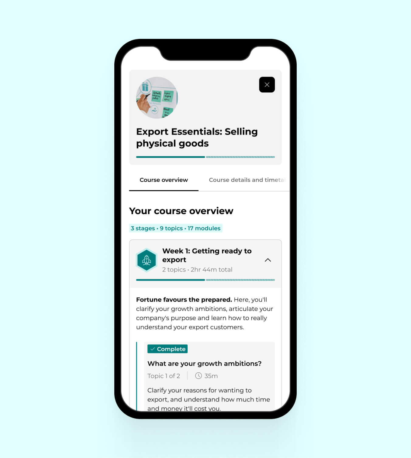
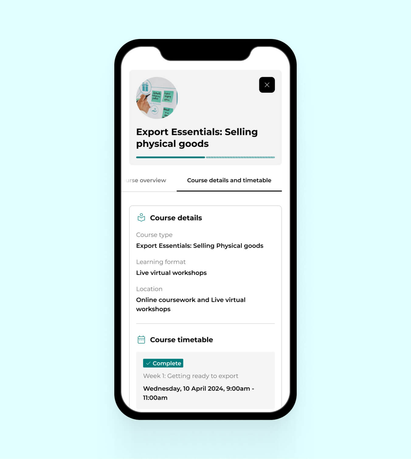
Users made it clear they wanted to see their course progress, so I updated the exisitng UI of the existing course pages to reflect this new requirement and designed a course info drawer with a comprehensive breakdown of their progress and course timetables and links, making it easy to keep up to date with their course work.
Rounds of user testing
Screens designed across 14 Interactive prototypes
Stakeholder approvals across 8 teams
Increase in course sign ups
Watch this space!
© 2024 Jim Pachal. All trademarks belong to their respective owners. All rights reserved.
